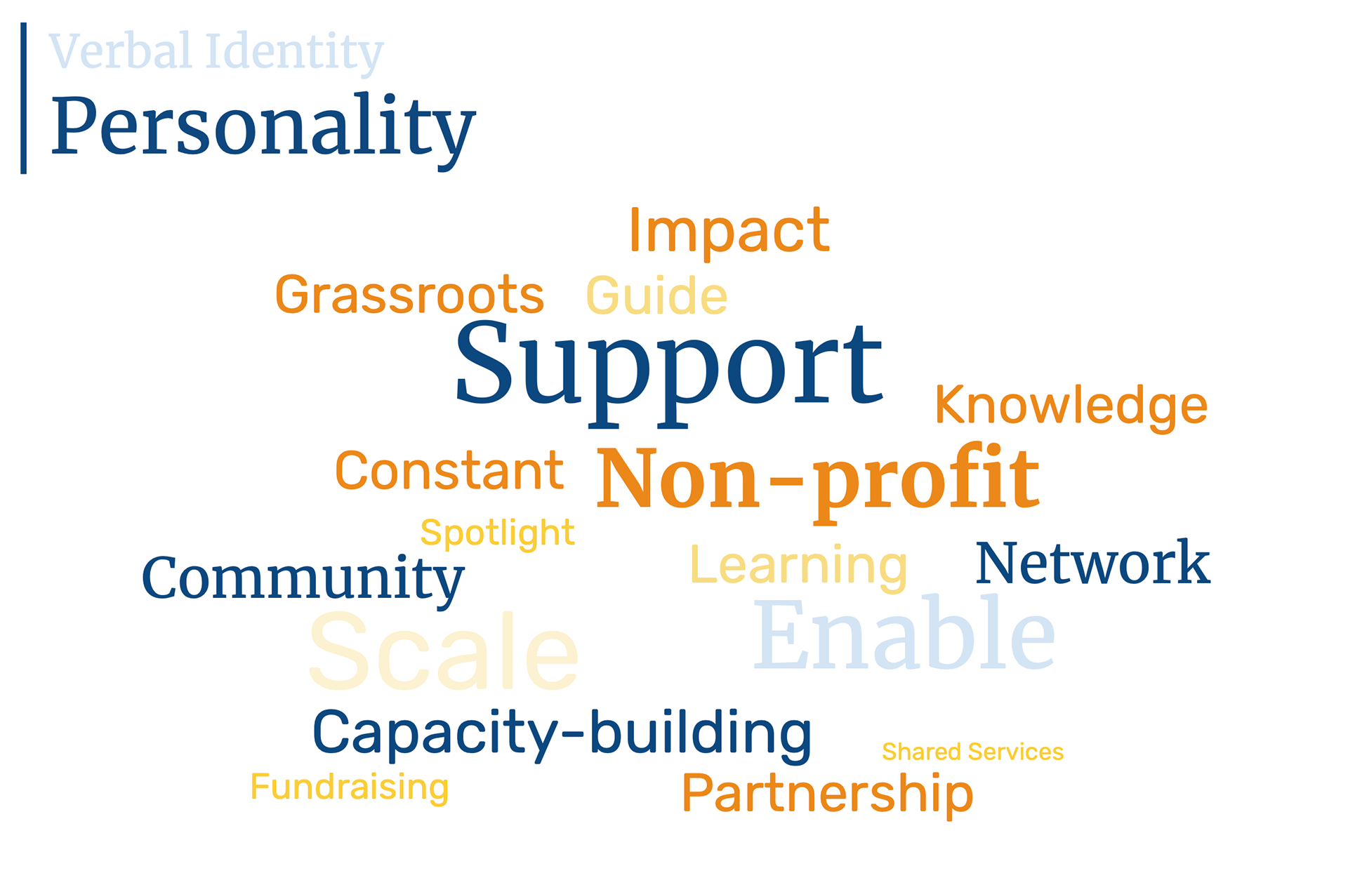
Bringing IPN to Life: A Cohesive Visual Identity
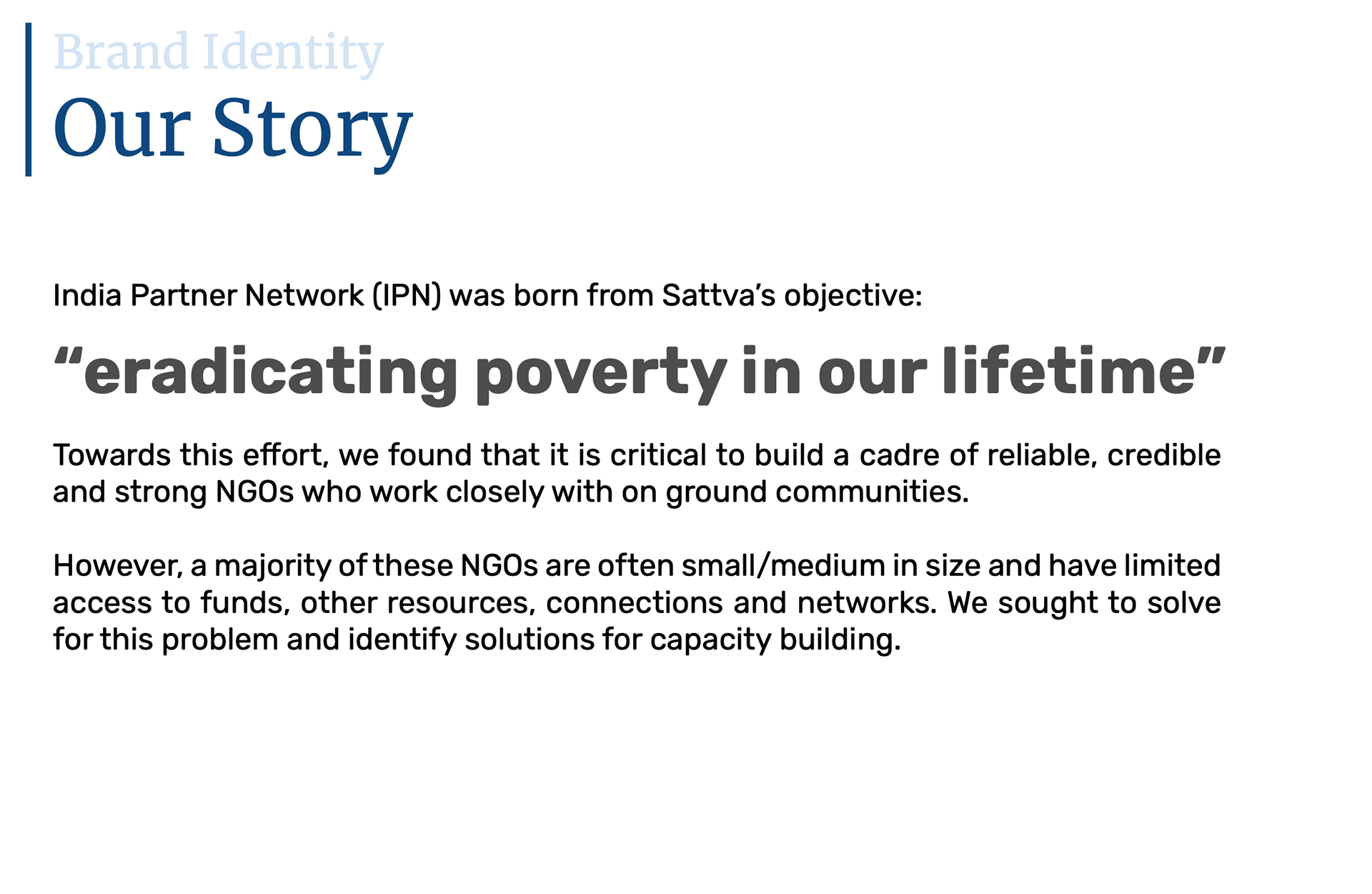
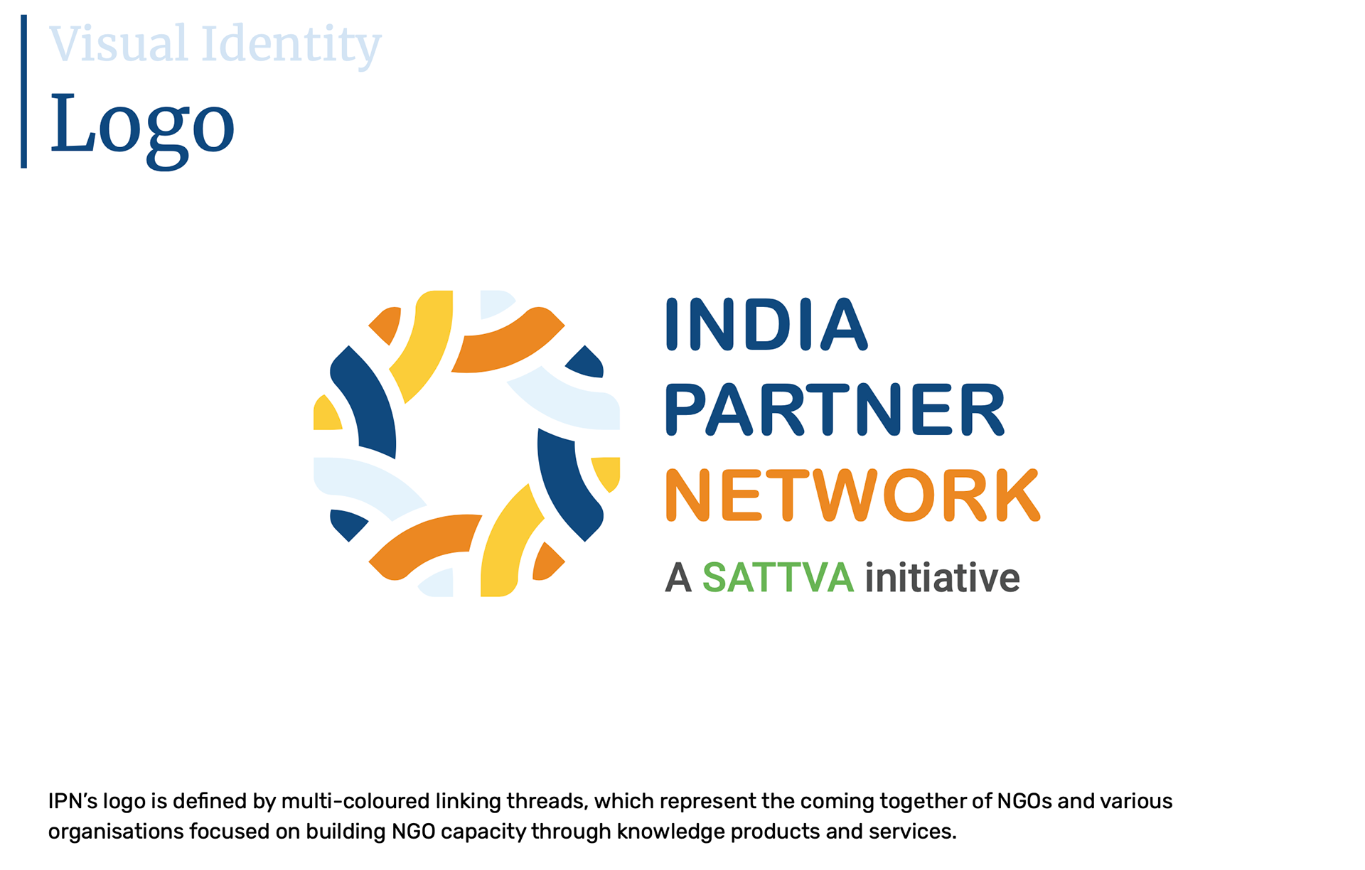
India Partner Network (IPN) is more than just a platform—it’s a movement toward empowering social impact organizations. To visually represent this mission, I collaborated with an external design team to craft a brand identity that reflects IPN’s values of collaboration, knowledge-sharing, and impact-driven growth.
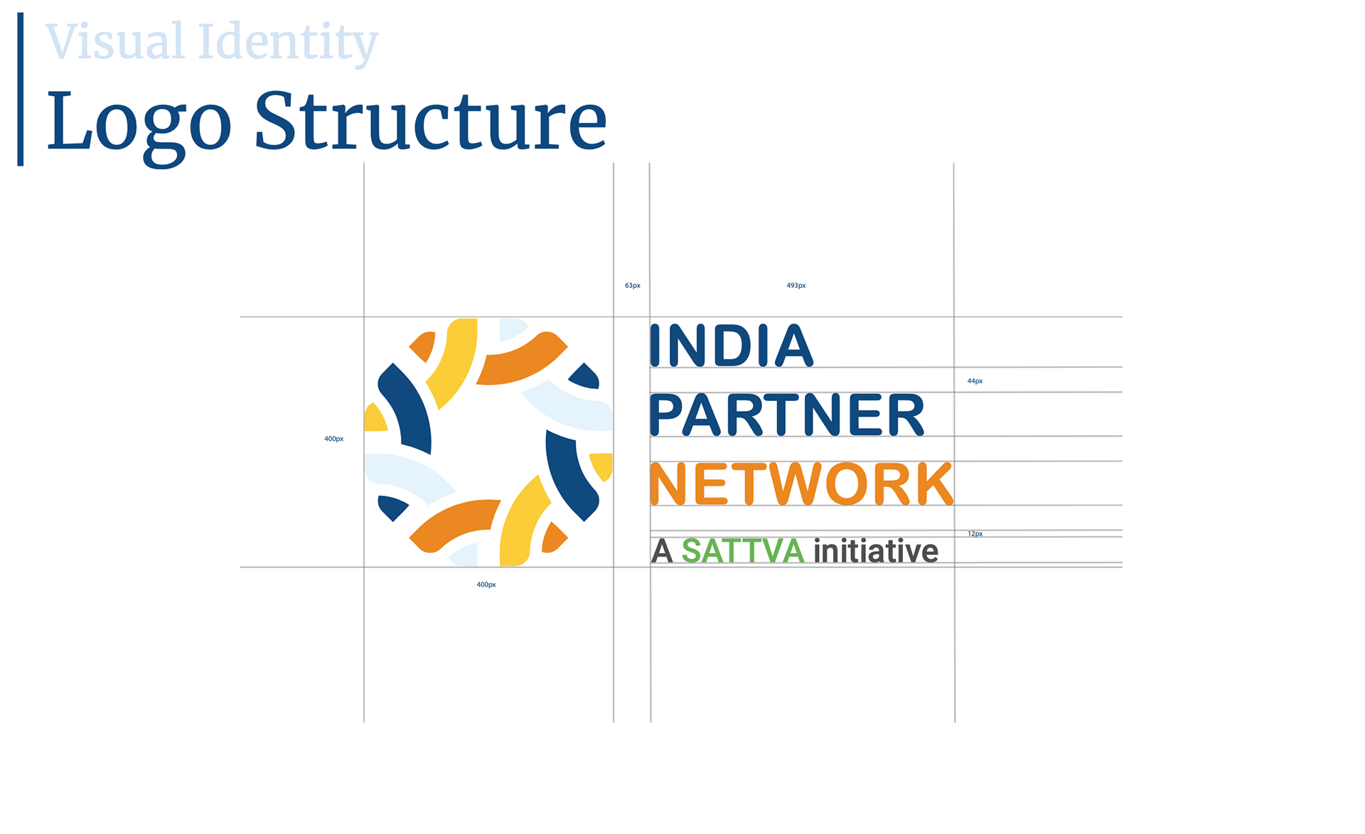
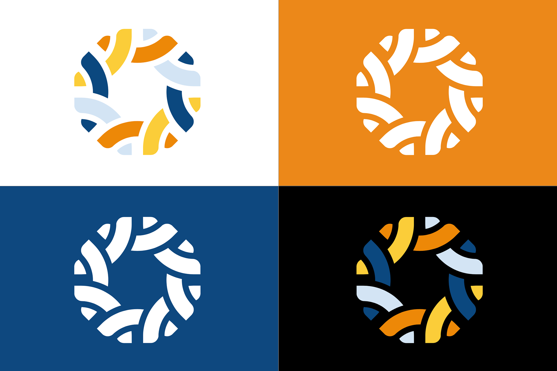
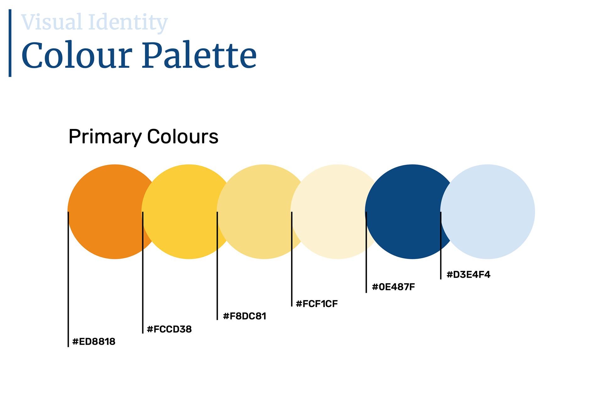
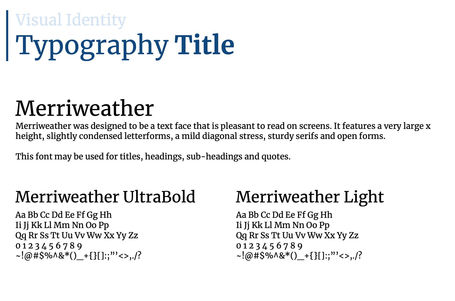
Working closely with designers, I ensured that every element—from the logo and typography to the color palette and visual language—captured IPN’s essence. The branding had to strike a balance between trustworthiness and innovation, appealing to a wide range of stakeholders, from grassroots non-profits to leading donors.
Key aspects of the branding process:
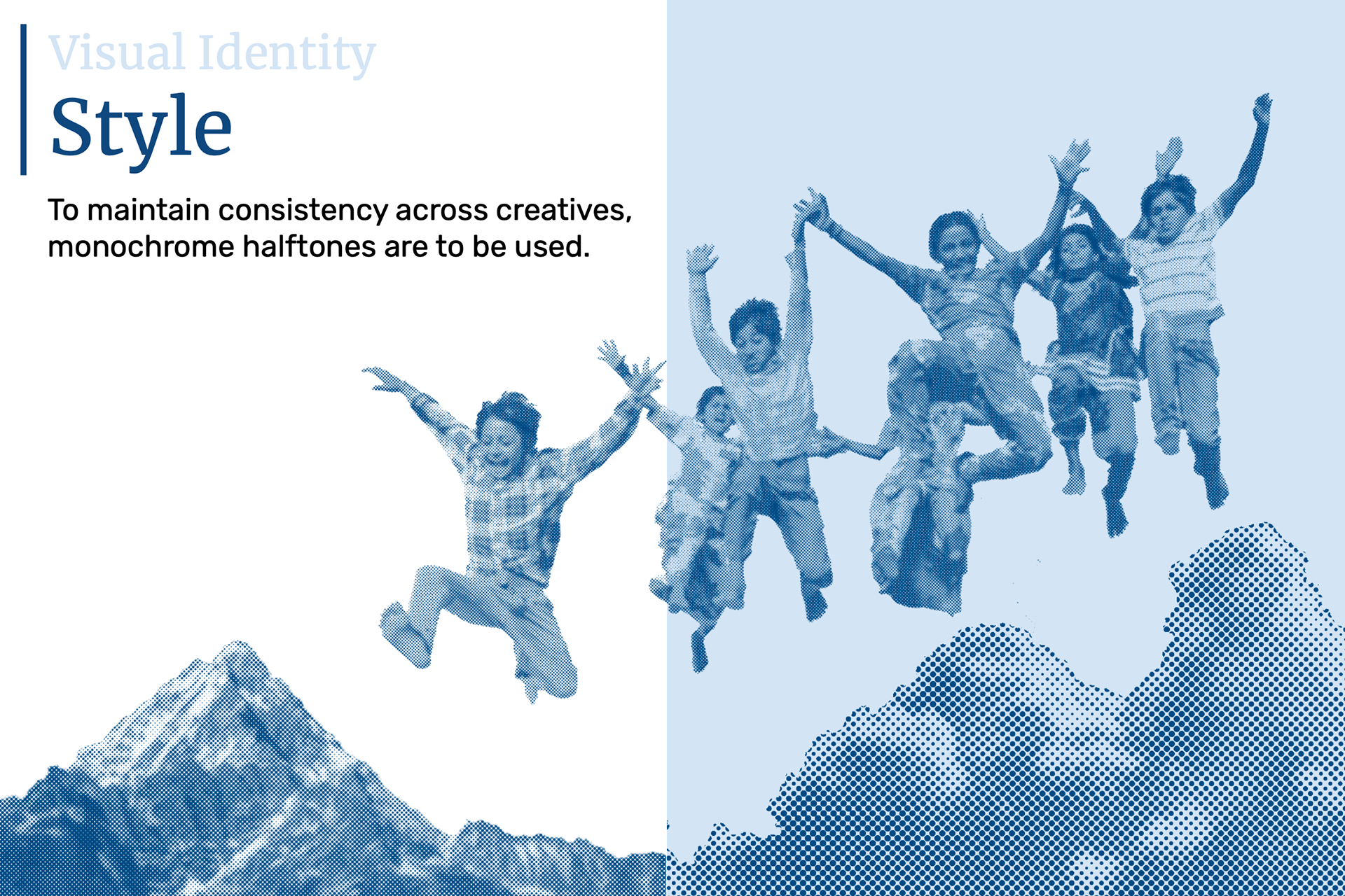
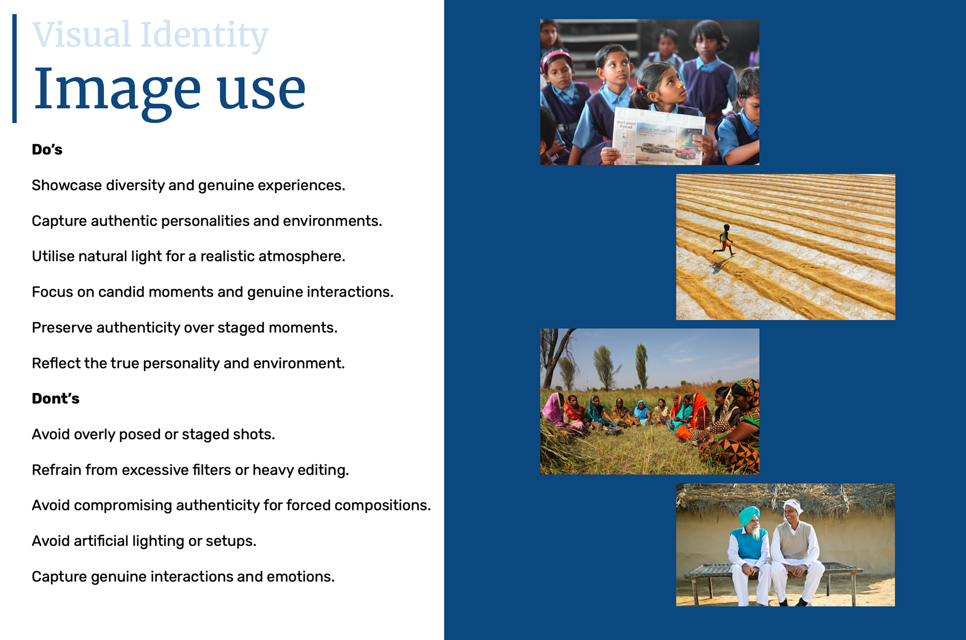
• Visual Storytelling: Designing elements that communicate IPN’s role as a catalyst for change.
• Brand Consistency: Establishing guidelines to ensure seamless brand representation across digital and print assets.
• Scalability: Creating a design system that allows for future expansion and adaptation.
Through this process, we built a recognizable, professional, and engaging brand presence that aligns with IPN’s vision to connect, empower, and scale impact-driven organizations.
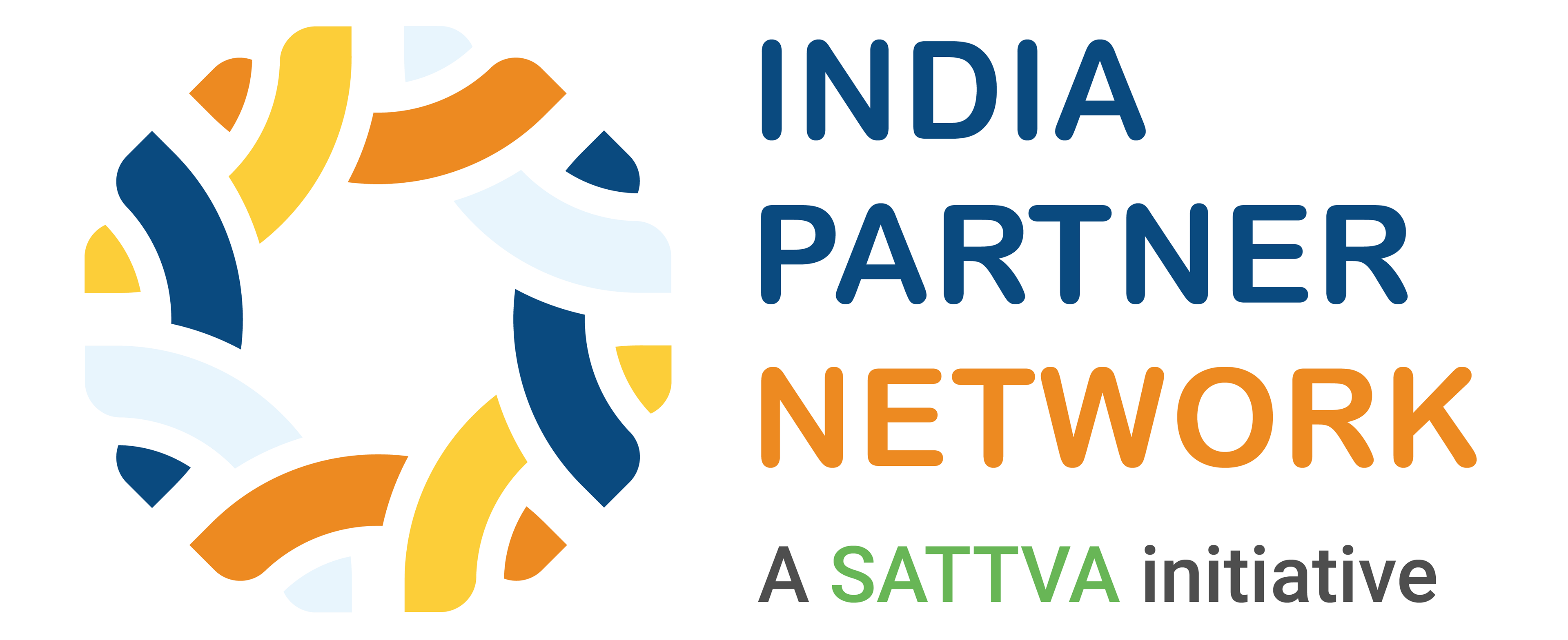
India Partner Network Brand Identity